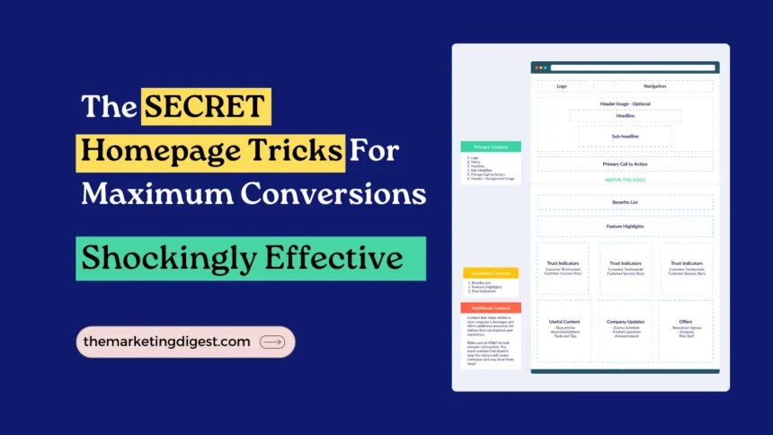
A high converting homepage is essential to the success of your website in the modern digital world.
Your site acts as the public face of your company, frequently giving visitors their first impression of it.
To increase conversions, businesses must focus on creating a high-converting homepage.
The virtual showroom of your online presence is your website’s homepage, which is frequently the first page visitors see when they arrive at your website.
There are a few essential components that your homepage needs to contain to establish a solid first impression and attract visitors to explore deeper.
Contents
————
This blog post acts as a market research specialist to help you develop a homepage that attracts, converts, and engages your target market.
Let’s go over the 9 essential aspects your homepage needs to boost conversions.
These suggestions will enable you to create effective homepage designs that are pleasing and strategically successful, regardless of whether you’re creating a new website or trying to improve an existing one.
1. Write Captivating Headline For High Converting Homepage
An attention-grabbing and intriguing headline for a high-converting homepage design is essential because it will be the first thing visitors see.
Content is king when it comes to creating a high converting homepage.
Your brand message and the value you give should be short and clearly expressed in a headline.
An effective way to attract and engage visitors is to enable compelling headlines for a high-converting homepage.
Use powerful action words and phrases to capture your visitors’ attention and persuade them to keep reading.
Example:
Slack’s H1 Title -> Made For People. Built For Productivity.

2. Add High-Quality Images For Effective Homepage Designs
Your homepage’s images play an important role in promoting your business and providing a pleasant visual experience.
Utilize high-quality images that represent your brand and the message you want to deliver.
Use visually appealing images, illustrations, or graphics to convey your brand’s core principles.
Examples of brands that use high-quality images for effective homepage designs:
| Airbnb | Uses amazing Images of its accommodations to evoke a sense of tourism and encourage people to make reservations. |
| Apple | To communicate a sense of refinement and flair, the company uses high-quality photographs of its products and accessories. |
| Warby Parker | Displays stunning pictures of their eyewear that highlight their distinctive and latest designs. |

3. Educate Users To Spark Interest
Clarify your purpose, capture attention, and highlight the advantages.
Educate users who have no idea what your product does or what your brand promotes and offers.
The first few seconds a visitor spends on your homepage are important. This is your golden opportunity to capture their attention and guide them towards taking a desired action.
It’s important to emphasize the features that set your product or service apart from those of the competition and other possibilities on the market while marketing it.
Ensure users feel confident they’ve found the perfect spot and that what you provide will revolutionize their experience.
Also Check: 15 Successful Steps To Your First Website Launch
4. Highlight Offers With Starter Plans
To help them buy easily, consider offering a “Starter Plan” or a package that includes your best stuff.
The Starter Plan should clearly show customers what they’ll get, the perks, and how it can save them cash or simplify their lives.
Keep the pricing straightforward with no hidden costs.
Make the checkout process simple without any unnecessary steps.
This lets customers test your service before they decide on a pricier plan, building trust along the way.
Example: If you offer a subscription-based service, you could create a Starter Plan that includes a free trial or a lower-priced version of your service that has fewer features than the full-priced version.
Take a look at Casper’s Homepage For Pricing Plan:

5. Present Social Proof, Credibility, And Validation
Showcase your legitimacy by presenting social proof, credibility, and validation as supporting evidence. This is an effective strategy for high converting homepage designs.
Social Proof
Customer testimonials, case studies, ratings, and reviews are social proof. Incorporating customer reviews and ratings for each product or service can demonstrate positive experiences with your business.
Utilizing social proof, like customer testimonials, on a homepage can foster trust and highlight the value of your offers to potential customers.
Credibility
Credentials such as professional certificates, awards, or media recognition can enhance credibility.
For example, if you’re a financial advisor, you might highlight your certifications and any industry accolades you’ve earned.
Validation
Validation can come in various forms, such as endorsements from industry experts or credible sources.
For example, if you operate a software company, featuring testimonials from respected figures in the field of computing who endorse your products or services can serve as strong evidence of your credibility and contribute to a highly effective homepage that converts well.
6. Point Out The Problem and Offer Solutions That Users Are Raising
A company can highlight the issue and showcase how its product or service can effectively resolve it by offering thorough explanations and real-life examples.
Example – If a company specializes in cybersecurity software, it could understand the challenges posed by data breaches and cyberattacks, illustrating how its product provides robust defense mechanisms against such threats.
Furthermore, they could provide concrete examples of how their solutions could have averted prominent data breaches that have occurred recently. This makes a high converting homepage and leads to effective homepage designs.
7. Keep It User-Centric For Effective Homepage Designs
Consider the perspective of someone unfamiliar with your brand or product and identify the key details they would need to grasp its essence.
To enhance your messaging and design, adopt the following approaches:
Highlight Unique Features
Emphasize the distinctive features or benefits of your product that differentiate it from competitors for high converting homepage.
Example: If you’re marketing a new smartphone, highlight its superior processing speed or battery life compared to other devices.
Use Statistics or Data To Support Your Claims
Provide data and statistics to substantiate your claims of superiority or effectiveness.
For example, if you offer weight loss programs, share statistics demonstrating the success rate of your clients compared to those of competing programs.
Show a Direct Comparison
Utilize a side-by-side comparison chart or graph to visually illustrate how your product or service stacks up against rivals.
Highlight any clear pricing, features, or performance advantages, as this can be particularly compelling.
8. Provide Effortless and Easy Navigation
Make sure your website visitors can quickly and effortlessly locate what they seek.
A navigation menu that’s intuitive and easy to use can streamline their journey and enrich their browsing experience.
Limit the number of categories and subcategories in your navigation menu to keep it simple and user-friendly.
Simplified and smooth navigation is key to a high converting homepage.
Example
| To help users discover what they’re looking for easily, the company maintains a simple and intuitive navigation menu with just a few categories and subcategories. | |
| Amazon | Uses a drop-down menu to make it simple for users to access particular product categories |
| Zoom | With just a few categories, Zoom’s navigation menu is kept to a minimum, allowing users to quickly access key pages like price and support. |
9. Add Clear Call-To-Action
A call-to-action (CTA) is the action you want website visitors to perform, such as submitting a form, buying something, or signing up for your newsletter.
Your CTA should be noticeable, clear, and simple to access. To make your CTA design stand out and grab attention, use contrasting colors and large buttons.

A well-crafted call to action can significantly improve the conversion rate of a high converting homepage.
Example
| Hubspot | Encourages people to join up for their marketing and sales software by using a large, unambiguous “Get Free CRM” or “Get Started Free” CTA button on their homepage. |
| Grammarly | A big “Get Grammarly It’s Free” or “Add to Chrome” button is provided by Grammarly to entice users to download their well-liked writing assistant browser plugin. |
| Hootsuite | Invites people to join up for their social media management software by including a big, unambiguous “Start Free Trial” CTA button on their homepage. |
Conclusion
In conclusion, you can more successfully attract potential clients and boost conversions by highlighting how your product or service stands out from competitors and other available possibilities.
Businesses can significantly improve their chances of turning website visitors into paying customers by incorporating the 9 essential components of a high converting homepage.
A high converting homepage should communicate the brand’s value proposition and unique selling proposition.
Businesses must continuously test and optimize their high converting homepage to maximize conversions and stay ahead of the competition.
Your high-converting homepage design may be made to be extremely effective and optimized, maximizing the potential of your website, by using these five key components.
Keep a simple, uncomplicated design and layout with lots of white space.
You can design a site that attracts people and motivates them to take action with a little amount of work and attention to detail.


